Sunday, November 13, 2011

Creativity and Deadlines

My friend Rob found this video and it so perfectly expresses the problems we have as creative people with externally imposed, arbitrary deadlines. Tight, pressure filled deadlines produce mediocre work because there's no room for creativity.

It's true that many jobs really aren't concerned with getting really creative answers; they frequently just want the job done on time and within budget. Our culture makes it really hard to be creative, honestly; there's a very strong tendency to try to make kids fit their ideas within small pre-defined parameters that fit a standard imposed from some outside source. There's a lot of pressure to conform, to not be weird and unusual and odd. But really, creativity usually involves thinking outside the box, outside the cultural norms, outside the accepted set of answers.

It's really hard to make a living in this culture if you're stubbornly creative, stubbornly original and weird and don't fit into the norms. And that's really sad. Just think of all that we're missing out on. Clocks in your hand. Clocks within a cat. Time caught in a flower. Draw a clock. What does it look like to you?

Saturday, September 24, 2011

Sunni Brown: Doodlers, unite! | Video on TED.com


This is for Debbie and me and everyone else who shakes their head when someone asks to see what you're drawing and dismisses it with a 'it's just a doodle'. Heh. Turns out it's an innate way of thinking and an important way to process information. Well worth watching. :) And maybe we can all just have more fun with our doodles. Thanks to Karen McVey for pointing this one out to me.

Thursday, September 22, 2011

A Non-Digital Sketch

Inspired by the Illustrator Intensive at the SCBWI Summer Conference in LA, I've been experimenting with non-digital (*gasp*) sketching. Paints are a very small/portable Windsor & Newton travel watercolor paint kit that Jeff bought me. The line work was done with a Pentel Pocket Brush Pen, which was recommended by David Small during the Intensive.

Apologies for the slightly blurry photo -- I was experimenting with the Squarespace app on my iPhone, and I think I jiggled the phone a bit when taking the picture. The monster water container in the back is a handmade pottery piece created by my friend Luisa and painted by me. I have a bunch more one-of-a-kind pottery pieces that we made to put on Etsy; it's just a matter of finding the time.

Anyway, I had fun with this quickie sketch! I'm still way more comfortable with digital but figure it's good to always be learning new skills.

- Debbie

Tuesday, September 20, 2011

Everything On It

There's a new book coming out of poems by Shel Silverstein, for anyone who hasn't heard about it yet. NPR books has an article about how it came about.

His family gathered together once a month for quite a while and read poems out loud to each other to winnow the 1500+ poems down to a manageable number to put into this new book. It's being lovingly designed to follow in the look and feel of previous books.
And it will include gems like this one, which you need to read out loud to get the best effect, just like all of his poems:

Italian Food
Oh, how I love Italian food.
I eat it all the time,
Not just 'cause how good it tastes
But 'cause how good it rhymes.
Minestrone, cannelloni,
Macaroni, rigatoni,
Spaghettini, scallopini,
Escarole, braciole,
Insalata, cremolata, manicotti,
Marinara, carbonara,
Shrimp francese, Bolognese,
Ravioli, mostaccioli,
Mozzarella, tagliatelle,
Fried zucchini, rollatini,
Fettuccine, green linguine,
Tortellini, Tetrazzini,
Oops—I think I split my jeani.

 My guys have grown up on Shel Silverstein, so they're going to love this one. But they still think Shel was a little scary-looking in his pictures. I told them I saw a picture of him laughing once and he had a great grin.
You are missed, Mr. Silverstein. I'm glad we get to have another book of your poems.

Tuesday, September 6, 2011

Creativity - a Ted talk by Ken Robinson

So this Ted Talk is moving, funny and really very important. Sir Ken Robinson talks about schools and what we value and how we teach our children to be afraid to make mistakes and how we kill their creativity. It's moving and powerful and even if you don't have kids I'm betting we all can relate to what he's talking about. Have a look, it's really worth it.


How do you encourage creativity?
Listening to kids and encouraging their interests, of course. Counteracting at least some of the messages they carry home about what's cool and what's a success and failure from school is also important, I think. Parents now were kids who went through the same system of squashing original, troublesome thought, though, and it's hard to break out of one's own programming to encourage wild creativity in your kids, especially when it gets you calls from the principal's office because your kid just has to get up and dance around the room when she's thinking, or draws wickedly rude, funny caricatures of his teacher or corrects the teacher's bad spelling in front of the class or yells at a mean kid who won't stop bullying a friend or bursts spontaneously into a loud song about Mr. Data's cat Spot during quiet time or writes a story about pioneers and kills off the main character at the end and makes the teacher and principal worried about why he didn't write a happy ending and he tells them it just had to end that way because the characters demanded it or...
ahem.

So what is a solution for kids?

Well, I had a long rant about the school system here and the horrible budget cuts and the under-appreciated teachers and how parents are expected to make up the budget shortfall and what about the promise of free quality public education in this country of opportunity and all that. It's a fact that kids from lower economic levels get fewer opportunities than rich kids. It'd be so great if their schools could have the resources to encourage them, even if their parents don't have the means to pay for music or dance lessons and sports and all that. It's really crazy-making for a parent with limited resources, and when it comes right down to it, there are more and more of us in that boat than before.

But. Ranting here won't change it, won't fix it. Listening to the kids, encouraging them in whatever excites them and grabs their interest, that helps no matter what their circumstances may be. And it may not be much, it may not be enough, but it's better than nothing.

Thursday, September 1, 2011

Doodle Questions

I've been thinking a lot lately about happiness, enjoyment of life, what is fun for me. I started thinking up questions to ask myself and doodling naturally took over. It's amazing what sorts of questions come out when you tell yourself you're just going to draw them for fun and stop worrying about whether you have to answer them or not. ;)
 I've been drawing silly and serious questions and letting them carry the same weight and the big questions keep sneaking in there.
Uncomfortable questions, things that we don't usually say to other people, secret stuff. I think maybe these belong in a private journal, I'm just not sure if it's a private journal of questions that anyone else might want to doodle around and write in and work on answering honestly or not, or whether it's just me in my own little run-around world who finds them interesting.
Why do you love that particular food? Why do you eat too much at one time? Why do you eat when you're feeling depressed? How do you change all of those things? Being uncomfortable isn't a bad thing, really, if you can look at those things honestly and let your inner observer and questioner speak up. It tends to be that quiet little inner voice that we often are so well-trained to squelch. What happens when you listen for it and let it speak clearly?
I think maybe if the questions are put in a fun, non-threatening way maybe they could become a real path for self-discovery. Of course it could be argued that its just another navel-gazing exercise in self-absorption, but I'm going to choose to believe that view is just that harsh inner critic trying to squelch the fun-loving, self loving voice.
We follow all sorts of rules all the time. We do things we hate because it's expected of us. We work jobs that suck because we need to make the money to buy the stuff and make our way through the materialistic world we live in. We teach our kids to behave, control themselves, eat properly and do their boring, rote homework and sit still and color within the lines.
What would happen to the world if we all colored outside the lines?
So I'm doodling more questions. If you think of any you want to add, just add in a comment here and I'll draw them up. :)


Tuesday, August 30, 2011

Doodlepost from Debbie


Still learning Photoshop CS5. I've gradually been switching over from Corel Painter. Though I've been a longtime Painter user, I've gotten frustrated by the crash-y updates. In PS, I need to get better acquainted with the process of creating custom brushes. For this daily doodle (originally posted on DebbieOhi.com), I was experimenting with PS's brush presets.

Hicklebees

Hicklebees is an independent children's bookstore in San Jose. I had heard of it from friends, since it's here in the San Francisco Bay Area down in San Jose, but somehow I'd never managed to get there before now.
up by the main counter
So, anyone who was at this year's SCBWI conference and heard illustrator David Small's keynote talk would know about Hicklebees; he talked about his fairly depressing experiences giving talks and signings at the big box bookstores, and then compared it with his happy experience at Hicklebees. He illustrated it with drawings and cartoons that made everyone laugh and applaud, and honestly it made all of us wish we could go to Hicklebees.
tucked away in a corner
I've mentioned before that all of the bookstores in our area have closed. Riley and I especially miss being able to go to our local bookstore and hang out and read. We usually went to Border's since it was friendly enough and we could get a hot chocolate and sit and read easily and the selection of books was decent, even if based mostly on sales status.

At the SCBWI summer conference there was quite a lot of talk about Borders going out of business and why and what that meant for the publishing industry, along with the whole e-book revolution and how we all had to adapt. Some of the publishers and agents who talked were saying that with the loss of the big box bookstores, probably the big stores like WalMart and Target and Costco would step up and start selling more books. The impression I got from them was that they had little concern about what this meant for regular people; they seemed more focused on sales numbers and market shares. Perhaps their jobs are too many steps removed from the end consumers, but it revealed a shocking blind spot on their part.

And I'll be honest here: their apparent unconcern for the people who actually buy their end products (people like me and my family) made my heart sink; it felt like a slap to those of us who aren't in the upper economic brackets who nevertheless love bookstores, books, reading and the whole experience of browsing books. E-books aren't something my family uses; we have no e-readers, no devices to make it easy and we're not likely to spend a chunk of the limited money we have on something like that. My boys are avid readers; they say that those stores like Costco and Target only have the more boring grown up books or baby activity type books and nothing much inbetween, which is sadly true.
There's a huge difference between coming to a place like Hicklebees, shown here, and standing in a noisy crowded Costco aisle looking at a chaotic, disorganized pile of scattered books offered on 2 big flat tables. It doesn't make for a pleasant experience, let me tell you. This crisis for the bricks and mortar bookstores really does affect people, and kids most of all. Our local library has had to cut their hours and what books they can acquire, which really impacts middle and lower income kids. The school libraries are affected even more severely by budget cuts. The lack of an accessible, interesting library and no available bookstores means kids don't get to use, see, feel or read books, unless they have determined parents who can take the time and money to drive long distances to go to cool places like Hicklebees. All of these things make it a whole lot harder for middle and lower income parents to expose their kids to reading, much less help them learn to love reading. Reading is not fun at Costco or Walmart. At Hicklebees it's like heaven for kids. That's what my kids said when we went there.
So the boys and I made a trek down to San Jose. Well, actually 2 treks, since Riley and I went the first time as a one-on-one outing and we loved it, and we ordered some books that are hard to get, so when those books came in we all went back. The second time I took some pictures. :)
There are books everywhere, of course. It's not a huge place by any means and the outside looks like a little hole-in-the-wall store in downtown San Jose, but it's charming both inside and out.
There are a lot of special little nooks and crannies to hang out in and read or play with the toys.
knights and horses
pop-eye dinosaurs to squeeze
over in the crow's nest area
conversation with a dinosaur

There's framed art, letters and other goodies on every spare bit of wall space between bookstacks.
wall of cool things from famous artists and writers
in the back corner with the train table
 And there are autographs and drawings in marker everywhere, especially on the back walls and doorways and bathrooms.
David Diaz- for Debbie!
Jules Feiffer
In a corner in the men's room
 The names you can find tucked away are famous and legendary and amazing and.funny. A sense of humor is everywhere you turn and it makes you wonder why the rest of the world doesn't seem to be this way. Are childrens' book people the keepers of most of the playfulness and humor in the world?
Santa in the men's
look for the mouse...
by the back room exit
Otter!
I'm not sure what the solution is to the changing market for books, and I know we all need to adapt.

 But I know with certainty that we need to keep the rare places like Hicklebees alive.


Wednesday, July 20, 2011

Creativity in unexpected directions

Creativity comes in many forms, but some come from what we tend to think of as dry subjects. Someone who can make math fun and interesting is a real treasure.

Okay, I confess: I've never been good at math, never liked it, never 'got' it. But here's someone who obviously gets it on a deep instinctive level and loves to make it fun so others can get it too:
Infinity Elephants
(Please forgive the linkages rather than embedded video; sometimes Blogger just doesn't cooperate with embedding videos, so links will have to do for now.)
There are a lot of other fun videos that Vi has made over on her blog. Take a little break and go see some of them. It's even educational so you don't have to feel guilty about it.

Vi Hart is a musician as well as a mathematician. She's composed a Septet of seven movements, seven voices based on J.K. Rowling's Harry Potter series. She writes musical pieces based an geometric forms, showing the intimate relationship between music and mathematics. She's played with ways to cut fruit into mathematical forms. She's made musical instruments out of paper (and burned them). She's made music boxes with a mathematical flair and then plays several together to show how Pachelbel's Canon is constructed.

So much creative thinking in so many directions from one person. It's really pretty boggling to think about. Ms. Hart comes from a creative family; her dad is George Hart, a mathematical professor who's now heading up the Museum of Mathematics.Here's hoping she can achieve her stated goal: to make math fun.

Thursday, July 7, 2011

portfolio crazy

So I'm betting that any of us who are going to the SCBWI Summer Conference are going more than a little crazy trying to pull together a new, clean, awesome and Very Impressive Portfolio That Will Make Everyone Who Sees It Faint From Your Mad Skillz.

No pressure.
If you're already all pulled together and serenely getting on with your well organized and fulfilling life, I don't want to hear about it.
Lots of portfolio bits all over the floor. Yeah, like that.
So, portfolios. There's a lot of good advice about how to pull one together, what sorts of work you should include, etc. Debbie's own story from last year's convention was a real eye-opener for some of us (myself included). I came away from it all thinking that having and being brave enough to show your own original 'voice' had to be one of the most important factors in getting anyone's attention there.

It's a very specialized thing, this Juried Portfolio review at this particular conference; there are tons of very competent, talented illustrators entering it. There were so many portfolios at last year's event that it amazed and humbled me that the judges managed to even walk by all of them, much less give each one considered thought. What made some stand out and others disappear beneath the noise level? All of those various factors everyone gives advice about come into play, of course: quality work, ability to tell a story, consistent characters, style, ability, presentation. But there's got to be something extra to grab a jaded, tired judge or art director or editor or agent who's wandering through the 10th aisle full of portfolios and just wants to go back to their hotel room and crash. And of course that special extra will be different for each of those people, so it's not like there's a sure-fire answer to what will work.

So I'm going to be blunt and rude and say what nobody seems to come right out and admit: Many, if not most artists try to follow set guidelines with the result that a lot of our portfolios end up resembling each other and they all start blending together for a tired art director who's seen it all. Many of us who went to the same art schools tend to end up with similar looks and subjects and presentations and others can easily spot a characteristic 'look' and quickly and easily dismiss our work. This is regardless of the fact that in almost any other context for a working artist, that particular quickly overlooked portfolio would stand out, showing clear competence and talent. The overall level of ability at this show is exceptionally high and when combined with the extreme specialization for childrens' book illustration, it makes it much harder to stand out. The art schools tend to standardize their approaches, their rules and requirements for a lot of reasons and the end result can be that they tend to turn out artists with cookie-cutter portfolios; they can actually discourage an individual's unique voice, though that's probably not their intent.

At least for me, art school emphasized versatility and marketability for a wide variety of markets, and it worked quite well; I got paying work right out of art school and have been working pretty steadily ever since. My versatility was a huge asset, but it never lent itself well to developing much of my own unique voice, since I was always drawing someone else's ideas. People like me who have worked for a wide variety of clients and markets end up having a diffuse base of subjects in a wide variety of styles that really don't fit this particular Juried Showcase's criteria, unless we work hard to make a specific body of work just for this purpose. And as always, time and energy are in very short supply. Time constraints and wanting to make a body of work for this specific purpose leads right back into that nasty feedback loop of seeking the sure-fire answer to what They are looking for. Which leads back to the question about how you can pursue your own unique voice if you're always trying to figure out what the amorphous They want. The very act of worrying about it really stifles any chance for that quiet little inner voice to be heard; there are so many other factors that tend to drown it out at the best of times, let alone when you're putting your fragile little dreams on display for hundreds of critical eyes. Dance like nobody's watching, as they say. Easier said than done.
Let's just be up front and admit that entering that show is totally intimidating and makes some of us (well, me anyway) seriously decide just about every day for weeks before we commit to it that we're going to just forget it, we're never going to get anywhere with it, we don't need the stress. And actually, that's what Debbie wanted to do last year about this time. And look what happened there- she went ahead and entered, never expected to get any attention, much less win 2 of the awards and get a wonderful boost to the new illustration side of her career. :)

The SCBWI Juried Showcase was a big win for her in many ways, but let me also say that the awards just in and of themselves wouldn't be enough to send an artist skyrocketing into wild success. Debbie is highly motivated, talented, friendly and approachable, very appreciative of mentorship; she's ready and more than willing to work her butt off to maximize any opportunities that come along. Fortune favors the prepared is a cliche, sure, but the bald fact is that Debbie worked very hard ahead of time to prepare for any opportunities that might come her way during the conference, and she also followed through and made very good use of the opportunities that the SCBWI Showcase presented to her.
Debbie with her portfolio at last year's SCBWI.
So, back in my own little hovel, I've been very discouraged about entering, I admit it. I go through this each year I enter, so it's not new. It's hard to be in my own little studio space with nobody but myself to look through all of my work. My tendency is to lose confidence and second guess everything until I'm tied up in knots. So this time around, after thinking about it all and wondering what the heck to do about it, if I even wanted to enter at all (for the umpteenth time), I've decided to just let go of any wishes and expectations from it all. I'll go ahead and enter anyway, but this year I'm not going to worry or try to second guess what anyone wants. Putting together a portfolio can a valuable exercise in letting you look over your own work with fresh eyes and re-evaluate what you've been up to; it's never wasted effort, even if it can be hard on one's self confidence (and one's will to live, but I may be alone in that one).

So, in my attempts to sort through my muddle about this, I've been going through my work and I've discovered that I just don't feel very connected with my illustration work. Some of my illustration styles just take too long to create, some I've outgrown, and let's get real: I haven't had enough time to create a whole new body of work of awesome childrens' book illustrations. My life is just too crazy-busy these days. I love drawing and I'm not going to be giving that up certainly, but then nobody's trying to take that away from me.

So why enter at all? In an attempt to remove my own stubborn blinders, I reexamined all of the images I've been creating for everything I do. And I discovered that I have a whole body of work that surprised me: my photographs. I've been creating a ton of  images in the course of just living life the past few years and some are manipulated photo illustrations and others are straight photos. But overall, the ones I really like seem to have a certain feel and a sort of consistent look. Maybe I've finally found my own voice, I'm not sure. I like them, though, they feel like me in some indefinable way. So those are what I'm going to go with for this particular portfolio. I don't care that there never seem to be any photographic portfolios in this show; there doesn't seem to be a specific prohibition against it. What do I have to lose? It may not fit what various people are looking for, it is very unlikely to get me new work, but that's okay. I can put out a simple portfolio of images that speak for me, and feel like I'm adding my voice to the chorus of talent singing out at this show. I feel at peace about it all for the first time in a long time.


-Beckett

Monday, July 4, 2011

Creative Collab Potential In Google+ Hangouts - by Debbie

I recently joined Google+, Google's latest social media experiment. Yes, I know what you're all thinking:

My comic about joining Google+

I like the interface in Google+ much better than Facebook or other social networks, plus I like the fact that you can have overlapping Circles of people you follow. Uploading images. links and videos for sharing is a simple drag-and-drop.

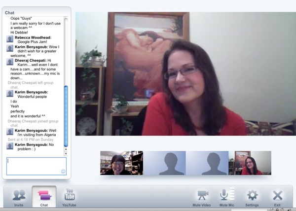
The video chat Hangout in Google+ is also pretty darned cool. Easy to participate, no tech knowledge necessary. Yesterday I joined out that author Rebecca Woodhead had set up ("come join me!") and also met other Google+'ers from India and North Africa. Had an impromptu jam session with Rebecca (who sang from England) and Iyaz Akhtar from TWiT.tv (played guitar, though he had to leave early), Karim Benyagoub (North Africa) and Dheeraj Cheepati (India).

Rebeccachat

I like that the Google+ Hangouts can have open or closed invites. Rebecca had posted a public invite, but you can also just invite a small circle of friends (even just one friend). Major collab possibilities!

- Debbie

Wednesday, June 29, 2011

Friday, June 24, 2011

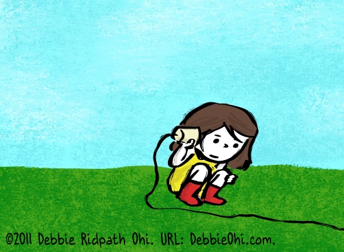
Drawing in Corel Painter: "Listening"

Pg002 girlcuplisten 002sm

I've started working on my SCBWI Illustration Portfolio for the Summer Conference, and drew this image yesterday as a possible piece to include. I've always liked images that tell a story on their own, but this time I'm also creating images before and after the one above to tell a longer story.

I created this in Corel Painter 11 (I have the newer version but it's too crash-y so am waiting until Corel fixes it) using a custom brush as well as the Flat Pen and Sponge brushes.

-- Debbie

Wednesday, June 22, 2011

Making a simple web page graphic

I had a small graphics gig last week to come up with a graphic representation of Mission Peak for the MPUUC Website, which is being revamped. I designed their logo for them a while back, so I suspect I have become their go-to graphic artist. :) Jeremy asked for a simple, clean and crisp silhouette of Mission Peak to act as a bridge between the title header and the body of the text for the front page. So I thought maybe I'd make a little demo of how I made the graphic in Photoshop. It's simple and surprisingly easy.
I started by looking for some photos in my own archives of Mission Peak for reference. It's faster and easier if I can simply use my own photos, and I don't have to worry about finding another person's image for source material and possibly infringing on their copyright.
Starting with a clean new file in Photoshop set to the size and resolution specs given to me, I drew an outline of the hills with the pen tool, the polygonal lasso tool and the fill bucket using my Wacom tablet and pen, restricting the pen to only straight line segments to make a simple silhouette.
I decided to make the image wrap seamlessly horizontally, in case the web guru needed to repeat the image across the page. Simple enough at this stage to change the shape of the hills to match on either side.
I use a new layer for each new color or line and I label each as I go along with clear names so I can always go back and easily find which part I need. This piece ended up using around 10 layers, I think. And I save new versions often with new names in a series, which was learned through hard experience. That way I have multiple backups and I can step back through my process to earlier versions if I go too far or in the wrong direction.

I got up and walked around and looked at it again, and it seemed way too plain as a simple silhouette to put up on a website, so I wanted to try shading the hills a bit, but I still wanted to keep a clean crisp simple look. I decided to keep the colors flat and the shapes sharp, and limit the color palette to only a few fairly muted colors (always a challenge for me). A simple brown light on the lit side of the hills seemed to work pretty well with a darker purple for the shadow sides, but then (of course) I craved more.
I chose a deeper purple and a sage green to add deeper depth to the lights and shadows, and darkened the brown highlights to a more middle value so the green bits could pop more.
And then the edges of the graphic looked too stark, so I added water gradations at the bottom of the hills, as you'd see if you were walking over at Lake Elizabeth and looking up to Mission Peak. I used only web-safe colors, so the gradations are deliberately more abrupt and graphic, but I figured that suited the overall style. I wanted the bottom edge of the graphic to blend down gradually to the white that will get used as the plain background for the text of the page.

I dallied with adding clouds at the top of the piece, but it quickly began to look too busy, and the title at the top needs to remain clean and uncluttered, so a clear blue sky seemed most appropriate. Then I doodled with adding trees around the lake in front of the hills and though that added to the busyness, it just made the whole piece read so much more clearly to me as Mission Peak that I couldn't resist. This area has trees everywhere; once I'd drawn the trees in it just looked wrong without them, so I left them in. (You can see more detail if you click on the image.)
The site isn't done yet, so I can't post a link to the finished piece actually on the site, but I'm looking forward to seeing how it looks with all the text and other page features. Hope all the Mission Peakers like it!
-Beckett